It's Less Important Than It Sounds
I surfed over from Jim's blog and I thought this was cool exercise. So I figured I would send my 2 cents in.
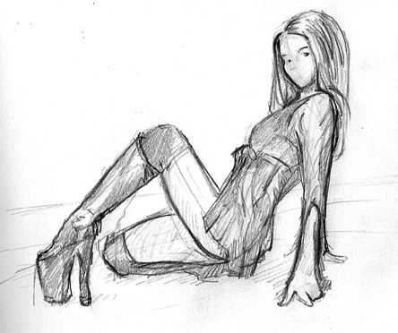
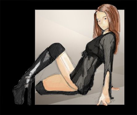
The sketch was just pencil to paper. Then I brought it into Photoshop to colorized it. I like them both for different reasons hence why I sent them both. You can chose one or both if you deem worthy.
DJ
(Semifatboy)
(Semifatboy)
5 Responses to “leanback-platform color and bw”
Leave a Reply
What have we got here?
-
This is my public turned personal sketch-blog. All the old stuff is still here, but anything new will be all mine, baby.
My Blog
Previous posts
Archives

Cool work. Good to have another person onboard. There should be another 2 II pics this friday.
Thanks.
I like the way the head looks.... you do anything special when you're setting it up?... I feel like I never get close to a likeness of the face but this feels pretty good to me.
Hell. I'm impressed. I agree with Jim on the head. Good work.
The head... hmmm what is my secret?
It is probably goes back to the book "How to draw comics the Marvel way" 20 years ago.
I'm not very good at portraits looking like who they are intended to look like. I just keep the face simple suggest the brow and suggested the nose in an Anime way. Big hair always helps too.